Jobbly: Crafting an intuitive job recommendations feature for job seekers
Jobbly: Crafting an intuitive job recommendations feature for job seekers
Jobbly, a mobile application, acts as a comprehensive job search repository, aiding individuals in discovering, saving, and learning more about desired employment opportunities. My primary responsibilities encompassed research, design, and prototyping, with a dedicated focus on creating a mobile app feature designed to seamlessly steer job seekers through their employment journey.
Jobbly, a mobile application, acts as a comprehensive job search repository, aiding individuals in discovering, saving, and learning more about desired employment opportunities. My primary responsibilities encompassed research, design, and prototyping, with a dedicated focus on creating a mobile app feature designed to seamlessly steer job seekers through their employment journey.
Primary Challenge
Primary Challenge
Job seekers often find themselves sifting through numerous job listings, attempting to uncover the perfect match for their skills and aspirations. In response to this challenge, the proposed solution is to develop an easy-to-use job search application. This application aims to comprehend the skill set of a job seeker, offering the best recommendations for jobs in a way that prioritizes user understanding and convenience. The objective is to create a platform that empathetically addresses the common struggles of job hunting, providing a personalized and user-centric experience.
Job seekers often find themselves sifting through numerous job listings, attempting to uncover the perfect match for their skills and aspirations. In response to this challenge, the proposed solution is to develop an easy-to-use job search application. This application aims to comprehend the skill set of a job seeker, offering the best recommendations for jobs in a way that prioritizes user understanding and convenience. The objective is to create a platform that empathetically addresses the common struggles of job hunting, providing a personalized and user-centric experience.
Product Objective
Product Objective
The central focus of initiating this project was rooted in the clear and compelling objective of aiding individuals in optimizing their job search process. Recognizing the substantial time and effort typically required in scouring employment opportunities, my primary goal was to streamline and enhance this experience. By leveraging technology and user-centric design principles, the project aimed to provide a solution that not only reduces the time spent on job searching but also empowers individuals with a more efficient and effective means of discovering relevant employment opportunities. Through thoughtful design and strategic implementation, my aspiration was to contribute to a more seamless and rewarding job search journey for users.
The central focus of initiating this project was rooted in the clear and compelling objective of aiding individuals in optimizing their job search process. Recognizing the substantial time and effort typically required in scouring employment opportunities, my primary goal was to streamline and enhance this experience. By leveraging technology and user-centric design principles, the project aimed to provide a solution that not only reduces the time spent on job searching but also empowers individuals with a more efficient and effective means of discovering relevant employment opportunities. Through thoughtful design and strategic implementation, my aspiration was to contribute to a more seamless and rewarding job search journey for users.
My Design Process
My Design Process
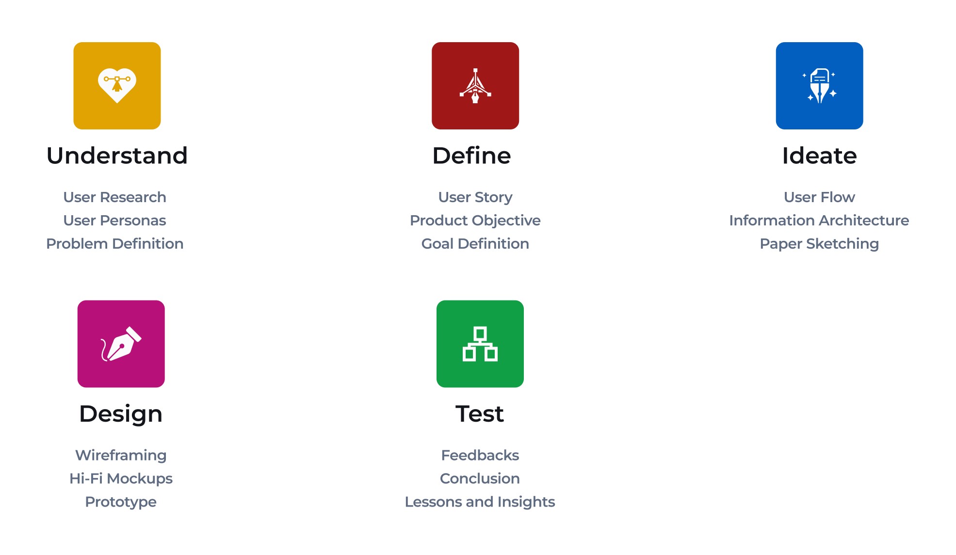
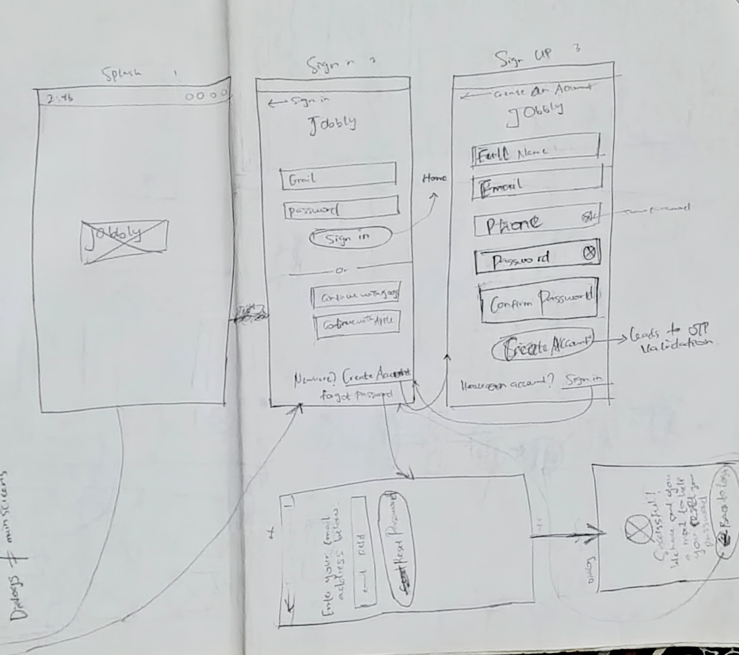
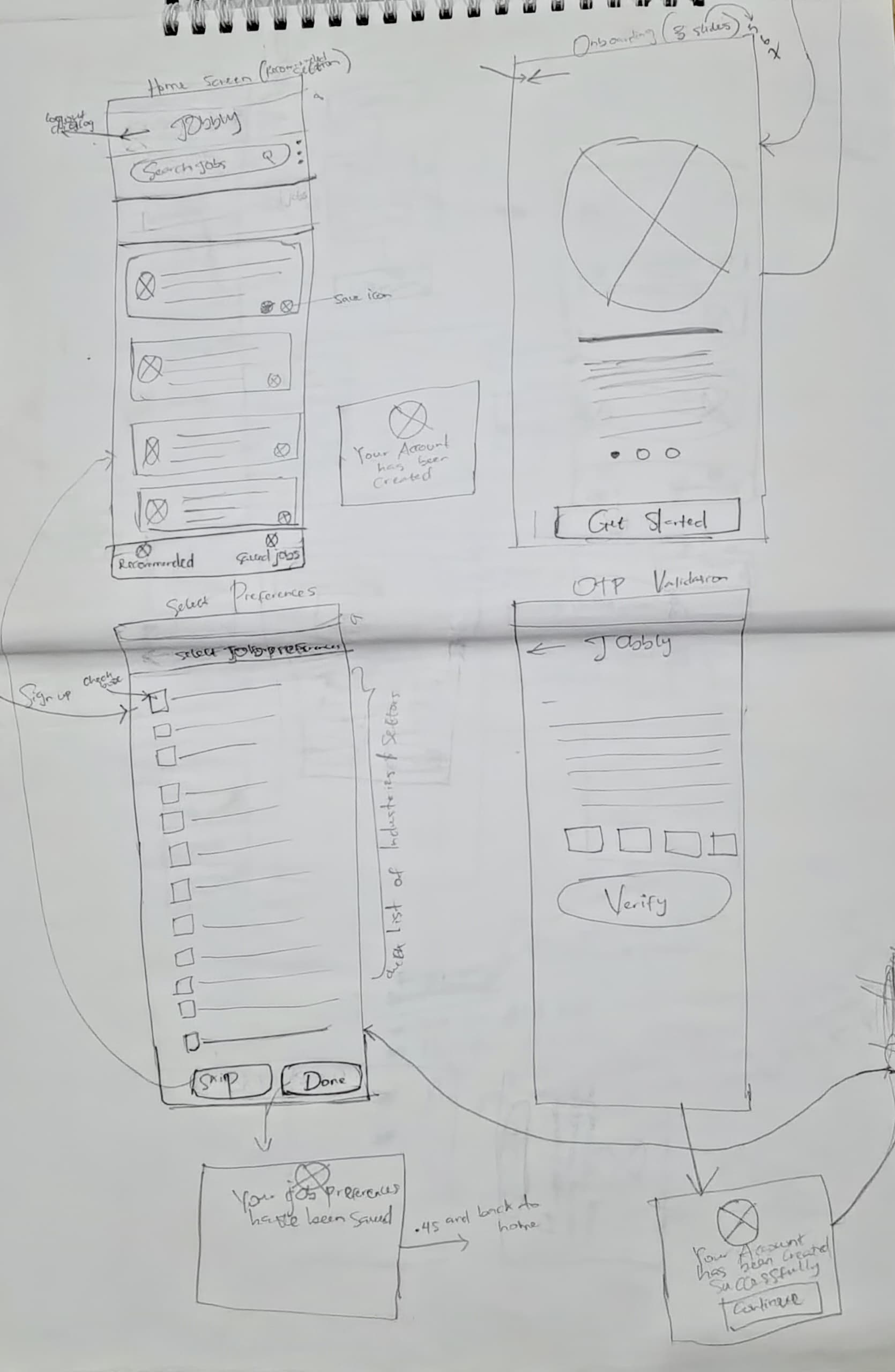
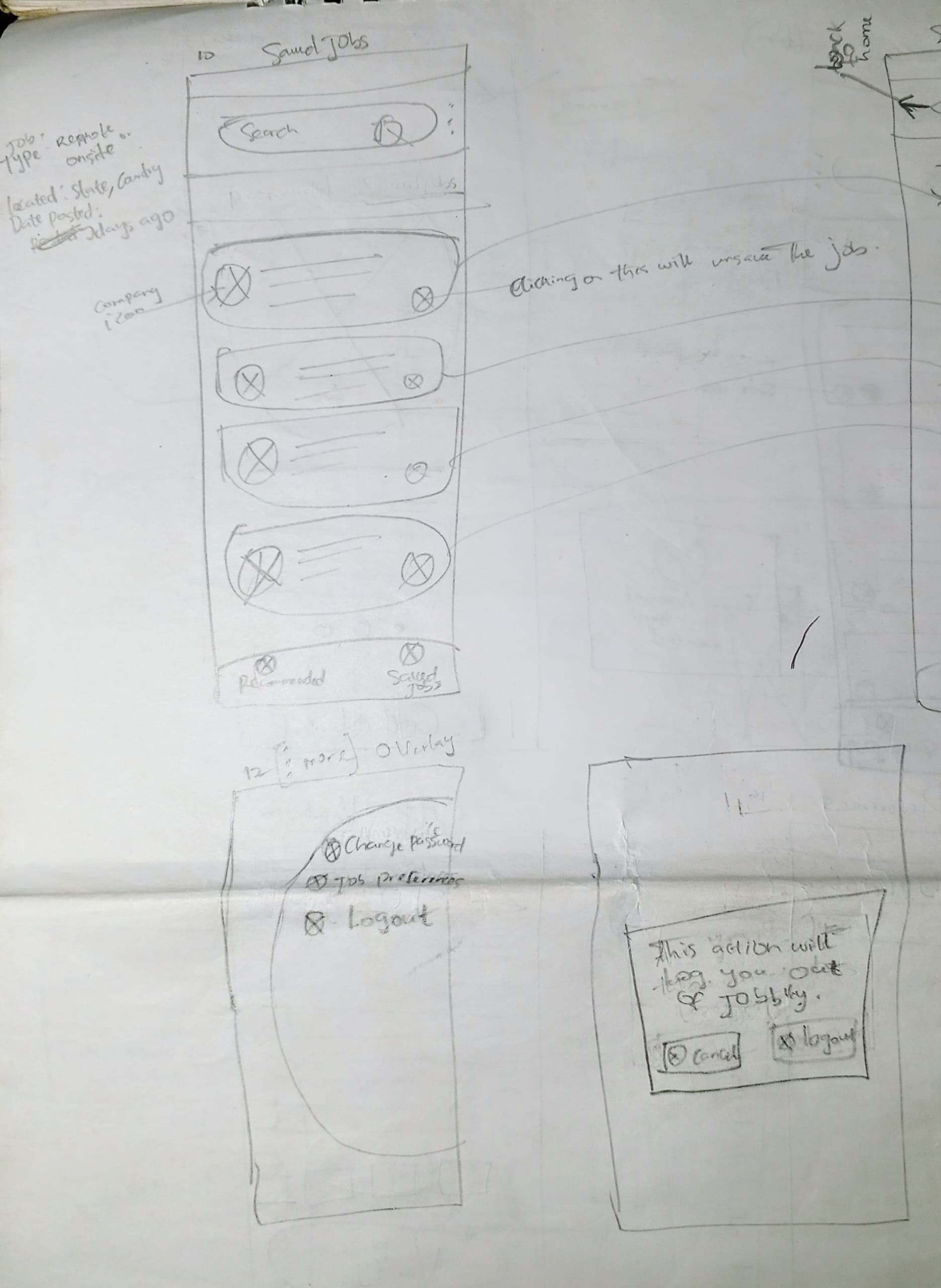
For this project, my design process commenced with the creation of low-fidelity paper sketches. These initial sketches were developed after thoroughly building and comprehending the information architecture and user flow. Beginning with low-fidelity sketches proved invaluable as it allowed me to pinpoint potential areas for improvement. Moreover, it revealed dialogs and screens that were overlooked during the information architecture stage.
For this project, my design process commenced with the creation of low-fidelity paper sketches. These initial sketches were developed after thoroughly building and comprehending the information architecture and user flow. Beginning with low-fidelity sketches proved invaluable as it allowed me to pinpoint potential areas for improvement. Moreover, it revealed dialogs and screens that were overlooked during the information architecture stage.
Progressing from ideation through wireframing to prototyping, this phase of the design journey spanned approximately thirteen weeks Throughout this iterative process, each stage informed the next, ultimately culminating in a refined and comprehensive prototype ready for further testing and refinement.
Progressing from ideation through wireframing to prototyping, this phase of the design journey spanned approximately thirteen weeks Throughout this iterative process, each stage informed the next, ultimately culminating in a refined and comprehensive prototype ready for further testing and refinement.
User-Centric Insights Gathering
User-Centric Insights Gathering
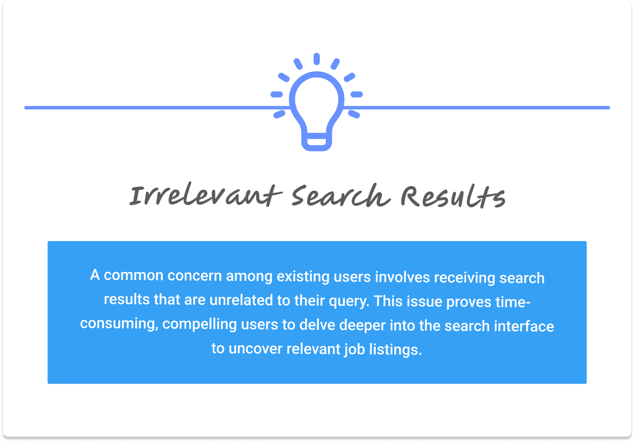
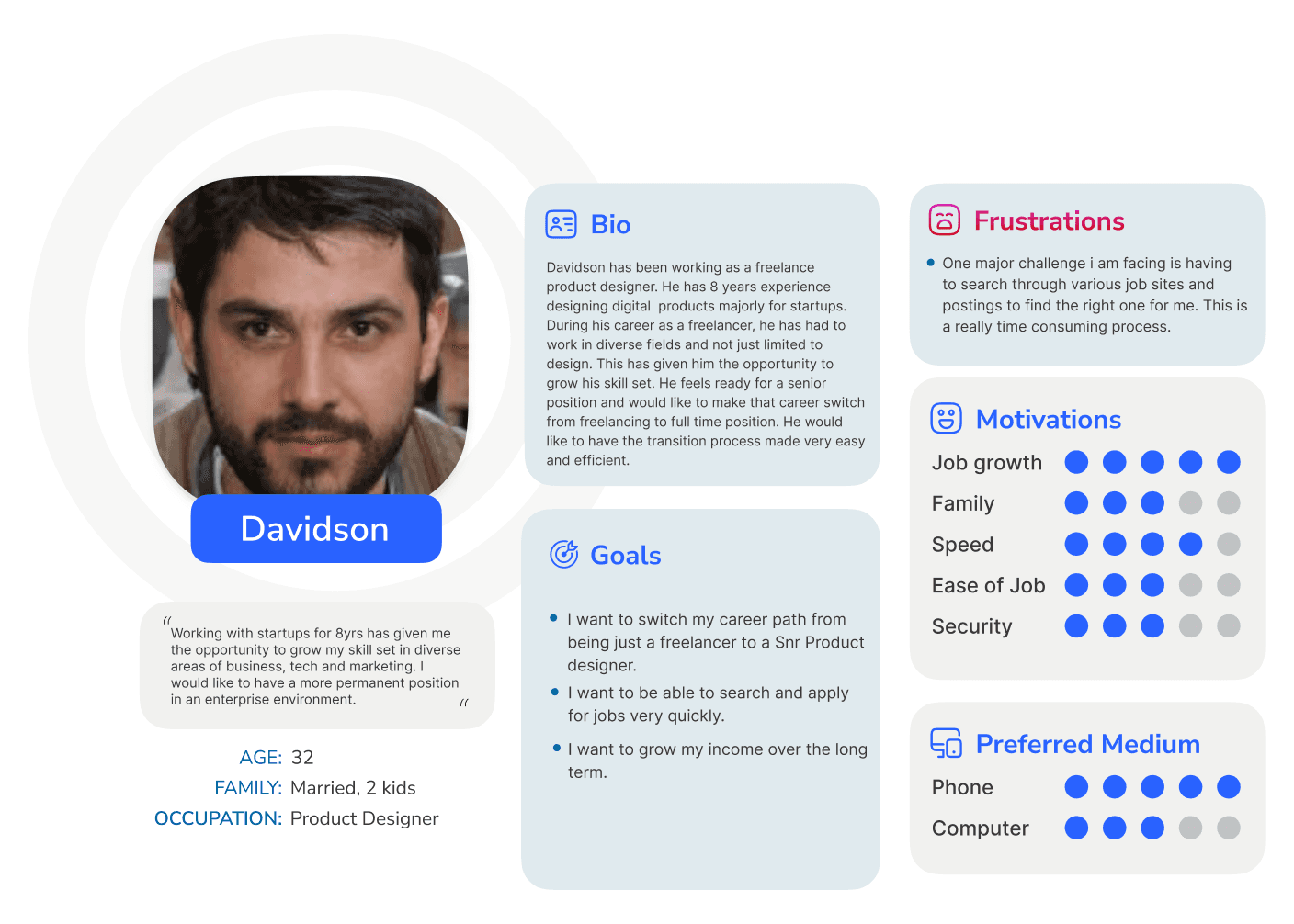
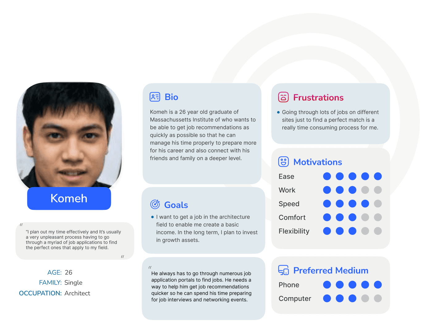
To deepen my understanding of potential users' experiences with existing job board platforms and glean valuable insights for creating an improved job search solution, I initiated a foundational survey. Engaging with a diverse group of job seekers provided firsthand insights. Additionally, a comprehensive analysis of user reviews for various job boards was conducted, aiming to grasp the challenges faced by current users in the job hunting landscape.
To deepen my understanding of potential users' experiences with existing job board platforms and glean valuable insights for creating an improved job search solution, I initiated a foundational survey. Engaging with a diverse group of job seekers provided firsthand insights. Additionally, a comprehensive analysis of user reviews for various job boards was conducted, aiming to grasp the challenges faced by current users in the job hunting landscape.

User Flow
User Flow
During the phase of outlining the information architecture for the app, a crucial aspect of the design process, I encountered unexpected scenarios and recognized certain missing screens. This realization prompted me to address edge cases and incorporate the necessary screens before diving into the subsequent stage of low-fidelity sketch ideation. This iterative approach ensured a more comprehensive and thoughtful foundation for the design, accounting for diverse user interactions and scenarios within the app's interface.
During the phase of outlining the information architecture for the app, a crucial aspect of the design process, I encountered unexpected scenarios and recognized certain missing screens. This realization prompted me to address edge cases and incorporate the necessary screens before diving into the subsequent stage of low-fidelity sketch ideation. This iterative approach ensured a more comprehensive and thoughtful foundation for the design, accounting for diverse user interactions and scenarios within the app's interface.

IDEATION
IDEATION
Low-Fidelity Sketching and Wireframing
Low-Fidelity Sketching and Wireframing
After swiftly reviewing my low-fidelity paper sketches, I promptly transitioned them into low-fidelity digital wireframes. This shift allowed me to efficiently navigate through the flow, gaining a deeper understanding of the required screens. The advantage of working with low-fidelity designs became evident as it enabled me to concentrate on constructing the structure and layout of each screen, avoiding getting bogged down by intricate details. Despite the benefits, a key challenge I faced was resisting the urge to perfect every screen, emphasizing the importance of prioritizing ideation over perfection during this phase.
After swiftly reviewing my low-fidelity paper sketches, I promptly transitioned them into low-fidelity digital wireframes. This shift allowed me to efficiently navigate through the flow, gaining a deeper understanding of the required screens. The advantage of working with low-fidelity designs became evident as it enabled me to concentrate on constructing the structure and layout of each screen, avoiding getting bogged down by intricate details. Despite the benefits, a key challenge I faced was resisting the urge to perfect every screen, emphasizing the importance of prioritizing ideation over perfection during this phase.


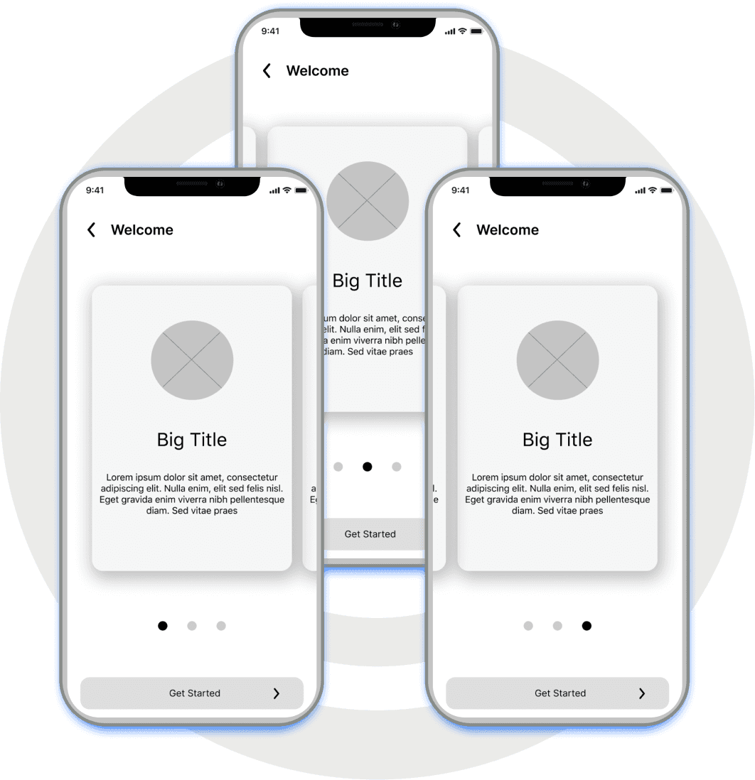
Onboarding UX
Onboarding UX
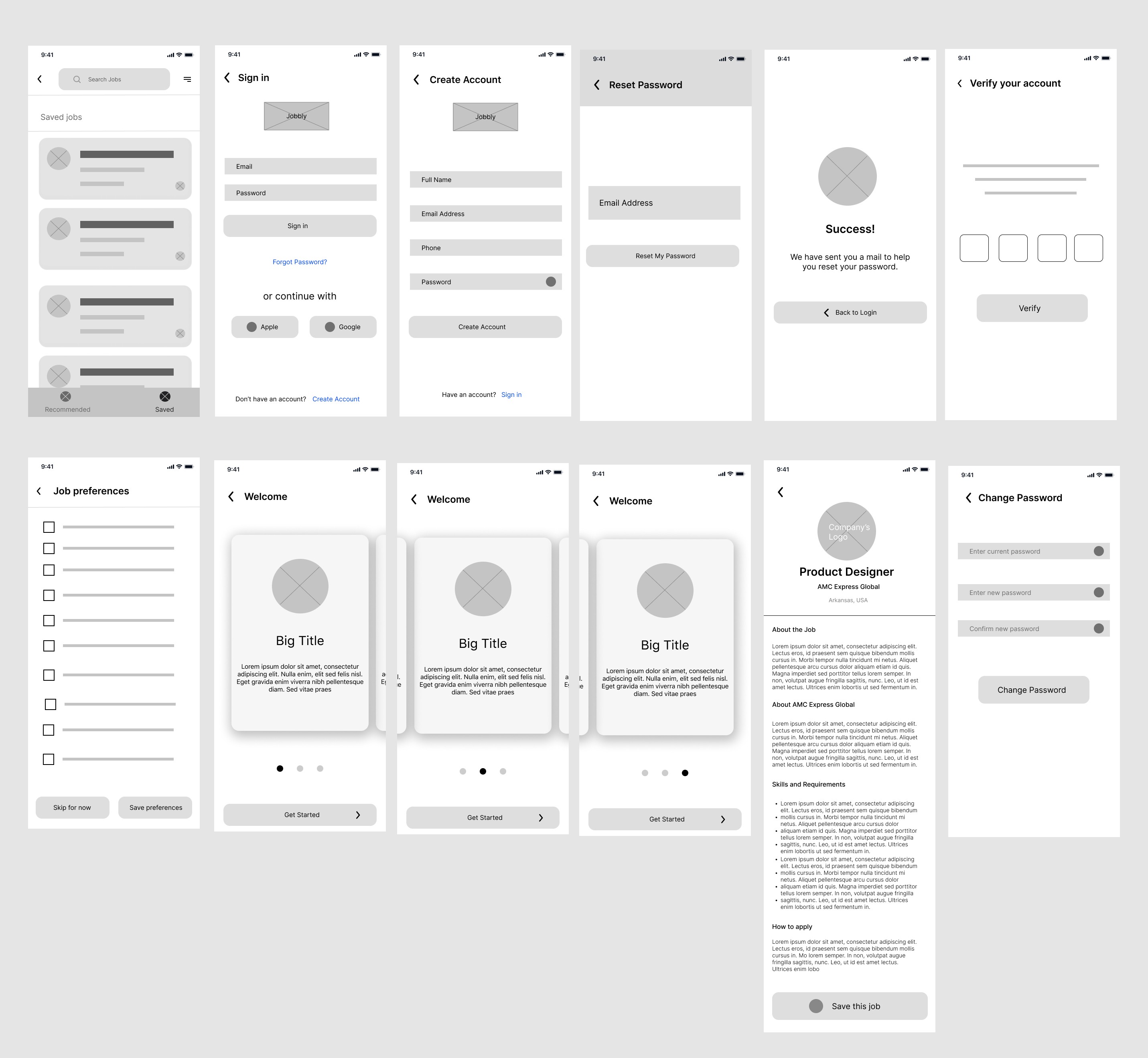
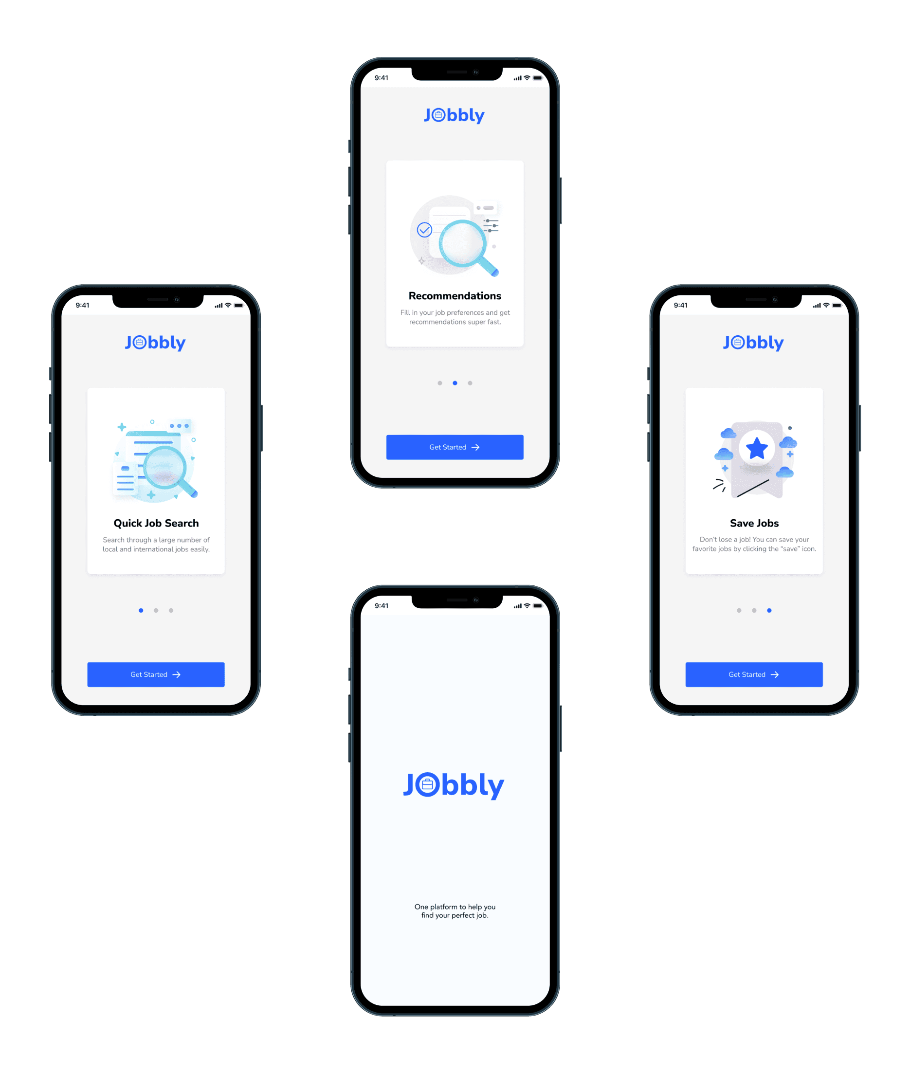
My design solution for the job search and recommedations issue has 3 main features; Quick Job search, Save jobs and Job recommendations. At least 59% of new mobile app users find onboarding sections in apps mostly useful. So, I built 3 wireframes to represent the onboarding screens and it is meant to briefly educate the user on the key features of the job search app.
My design solution for the job search and recommedations issue has 3 main features; Quick Job search, Save jobs and Job recommendations. At least 59% of new mobile app users find onboarding sections in apps mostly useful. So, I built 3 wireframes to represent the onboarding screens and it is meant to briefly educate the user on the key features of the job search app.
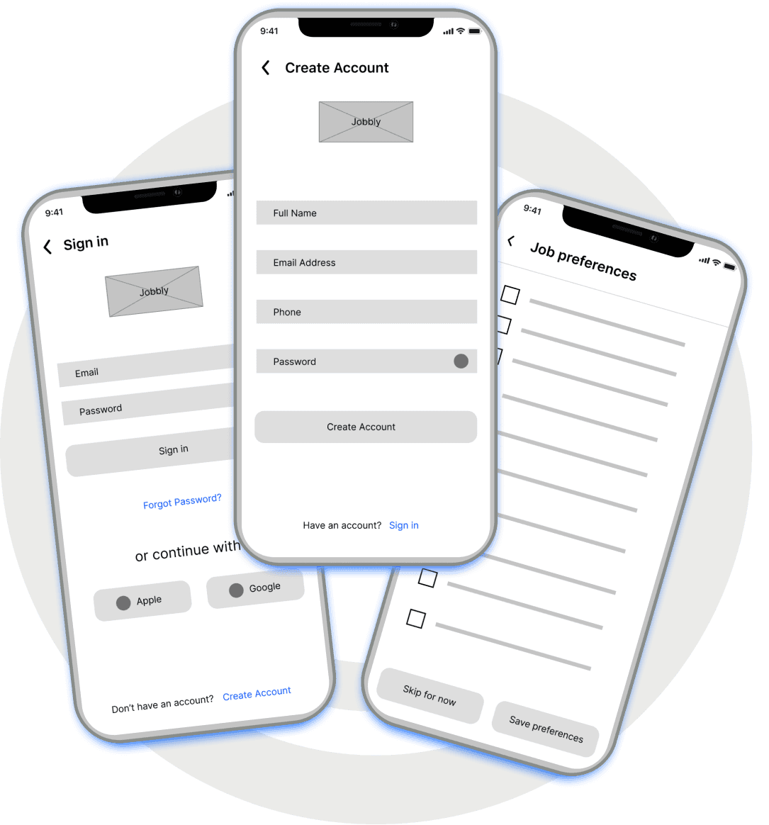
Signup and Login
Signup and Login
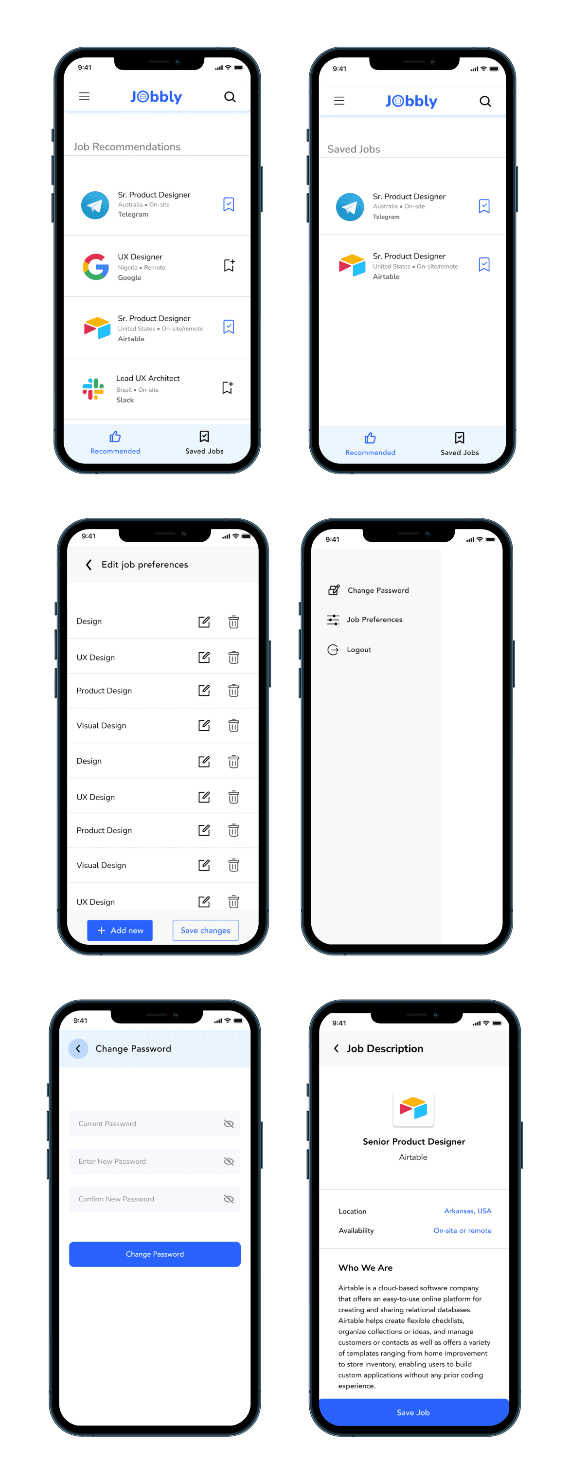
I built the wireframes for the signup and login process keeping in mind the fact that modern users are needing faster ways to sign up on digital platforms now more than ever. I excluded a “Confirm Password” field for the signup form and instead added an icon that helps the user show or hide their password. The job preferences screen would let the user select or enter the industries they want job recommendations from the most.
I built the wireframes for the signup and login process keeping in mind the fact that modern users are needing faster ways to sign up on digital platforms now more than ever. I excluded a “Confirm Password” field for the signup form and instead added an icon that helps the user show or hide their password. The job preferences screen would let the user select or enter the industries they want job recommendations from the most.
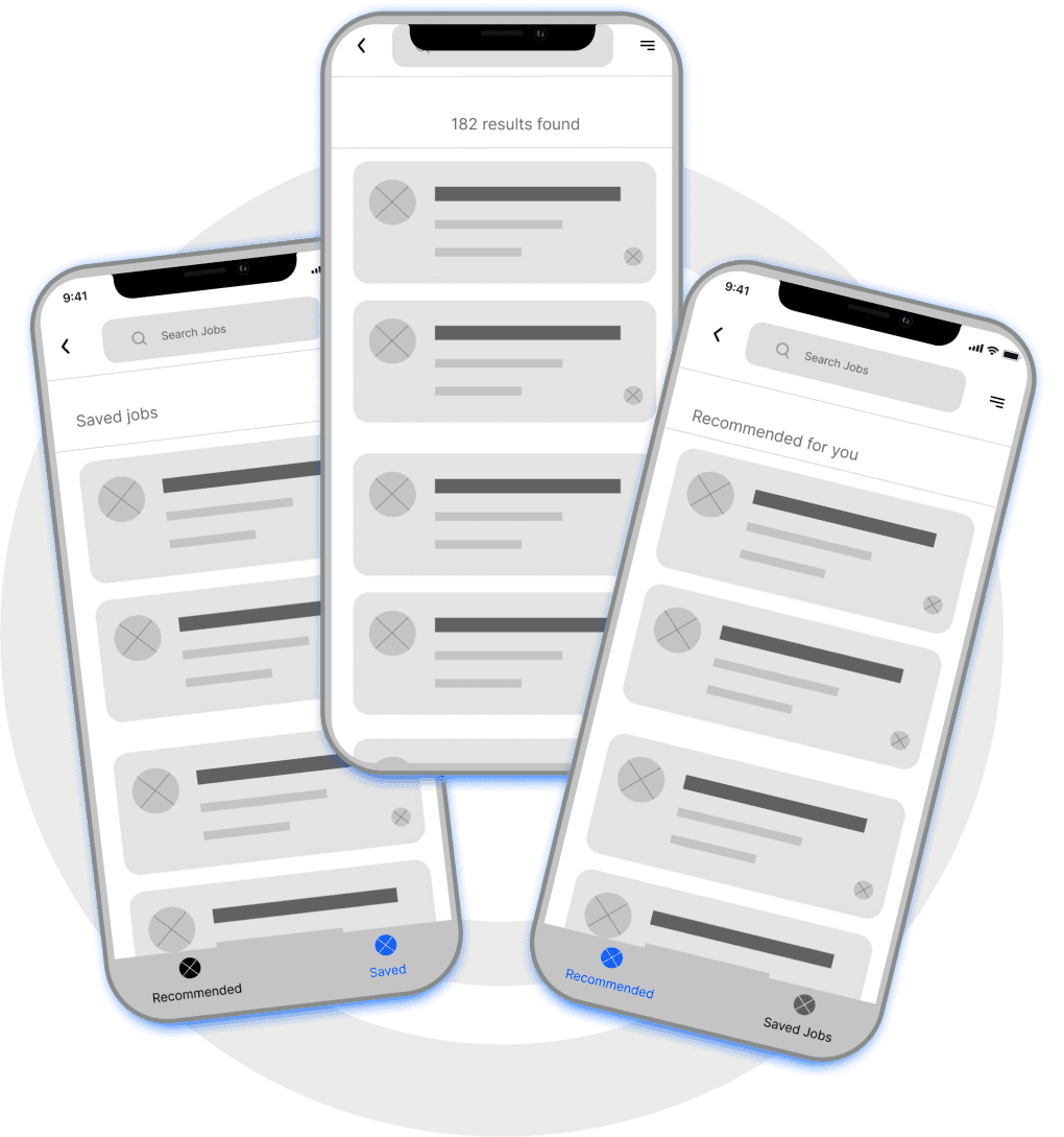
Home and Search
Home and Search
I decided to add the two important features {recommended and Saved Jobs) as the navigation bar for the home screen. During wireframe ideation, I structured jobs with UI cards, but much later in the visual design phase, I simplified it by using gray lines as dividers for the job feed.
I decided to add the two important features {recommended and Saved Jobs) as the navigation bar for the home screen. During wireframe ideation, I structured jobs with UI cards, but much later in the visual design phase, I simplified it by using gray lines as dividers for the job feed.
Style Guide
Style Guide
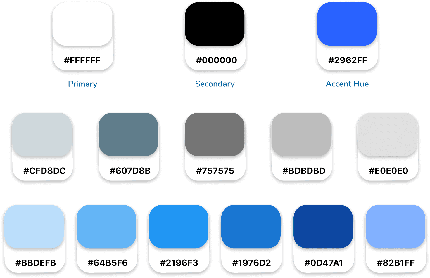
I opted for white as the primary color and black as the secondary color because the high contrast between black text on a white background enhances accessibility, particularly for those with visual impairments. Additionally, I selected a shade of blue as the main accent color, aligning with the industry context of the project.
I opted for white as the primary color and black as the secondary color because the high contrast between black text on a white background enhances accessibility, particularly for those with visual impairments. Additionally, I selected a shade of blue as the main accent color, aligning with the industry context of the project.
DESIGN AND PROTOTYPING
DESIGN AND PROTOTYPING
High Fidelity Solution
High Fidelity Solution
After testing a basic low-fidelity version of the app and evaluating the wireframes, I transitioned into the visual design phase for the project. Adopting a minimalist design approach, my emphasis was on prioritizing functionality over intricate details.
After testing a basic low-fidelity version of the app and evaluating the wireframes, I transitioned into the visual design phase for the project. Adopting a minimalist design approach, my emphasis was on prioritizing functionality over intricate details.
Onboarding Screens
Onboarding Screens
Signup and Login
Signup and Login

Job recommendations, Search, and Menu
Job recommendations, Search, and Menu
CONCLUSION
CONCLUSION
Insights and Outcome
Insights and Outcome
In reflecting on the visual design phase, a notable challenge surfaced in formulating UX copy for the app. Overcoming this hurdle involved revisiting early ideation deliverables, including the problem statement, goals, and personas. This strategic approach allowed me to craft more meaningful copy, shifting from addressing the user to communicating with the user.
In reflecting on the visual design phase, a notable challenge surfaced in formulating UX copy for the app. Overcoming this hurdle involved revisiting early ideation deliverables, including the problem statement, goals, and personas. This strategic approach allowed me to craft more meaningful copy, shifting from addressing the user to communicating with the user.
As a valuable takeaway, I plan to incorporate mid-fidelity wireframes in future projects. This adjustment not only affords me the time needed for thorough ideation but also facilitates the integration of actual content at an earlier stage, streamlining the overall design process and enhancing the coherence of the final product.
Thank you for reading. You can check out more of my projects in this page.